Hotel checkout video setup: assets to gather first
Stop polishing your homepage hero reel as if the booking is won the moment someone sees the infinity pool.
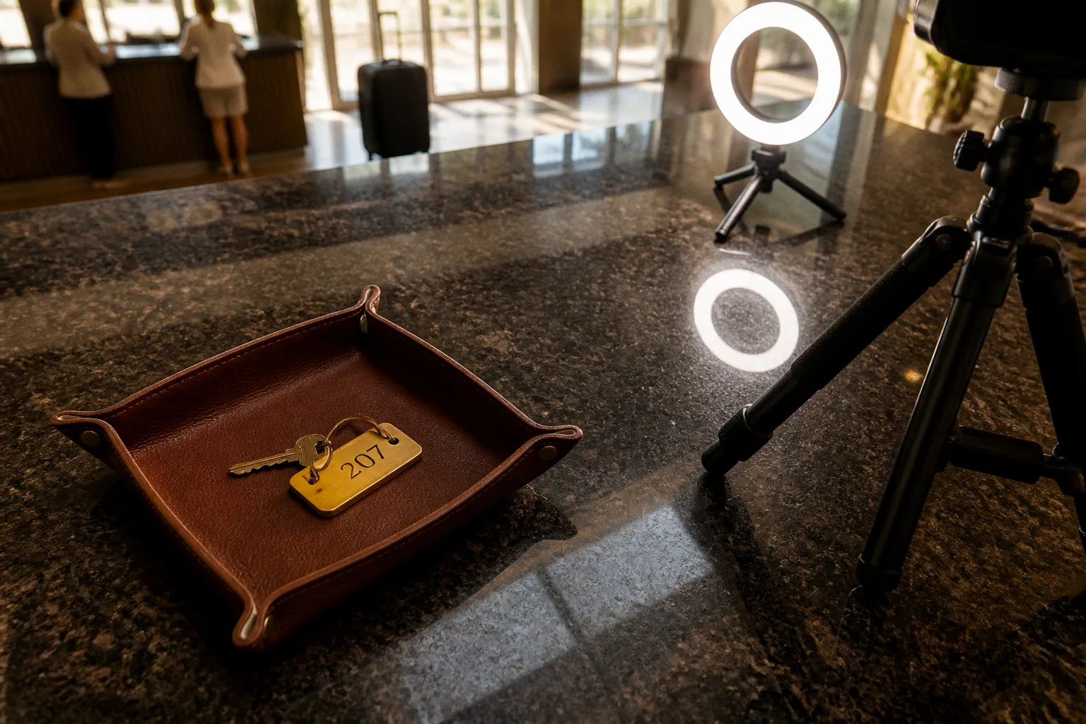
Most hotels put video in the wrong place. The checkout page is where money gets decided.
Your cinematic drone footage may build desire, but it is not doing much for the guest who has already selected dates, compared rates, and started entering payment details. That is the point where the decision gets delicate.
The booking engine is where aspiration meets arithmetic. Taxes appear. Cancellation terms get read properly for the first time. The room that looked perfect in a grid now has to feel worth the final total. A guest who was confident ten minutes ago starts looking for reasons to pause.
That is why the hotel checkout video assets checklist should begin at the bottom of the funnel, not with another broad property montage. Video belongs where hesitation lives: beside the room they are about to book, near the amenity that justifies the rate, or inside the arrival experience they are trying to picture before committing. The checkout page is not a gallery. It is a closing room. Treat it like one.
Why checkout is the actual conversion battleground
The booking engine has a different job from the homepage. The homepage introduces the property. The checkout flow has to remove the final reasons not to book.
Hospitality benchmarks vary by market, device mix, booking engine, traffic source, and how abandonment is measured. Some operators report booking engine abandonment rates as high as 85%, but that figure should be read as a warning about leakage rather than a universal rule for every hotel. The useful question is not whether your property matches a headline benchmark. It is where your own guests stop moving forward.
They may leave at date selection when availability looks thin. They may drop off at the rate comparison screen when the total no longer resembles the initial search result. They may reach the guest details form and decide that the process feels too long, too generic, or insufficiently trustworthy. Some will be comparing your page with an OTA in another tab. Others will simply need one more piece of evidence that the room, location, and experience justify the money.
The causes are familiar:
- Taxes, fees, or restrictions appear later than expected.
- Cancellation language is difficult to scan.
- Room categories sound interchangeable.
- The visual content shows the property but not the room being purchased.
- The payment page feels disconnected from the hotel brand.
- A mobile form creates too much work before the guest reaches confirmation.
- The guest cannot picture arrival, the view, the bathroom, or the practical details that matter to them.
Video cannot solve all of those problems. It cannot repair a confusing rate structure or make an unavailable room appear. It can, however, supply context at the moment a static thumbnail and a paragraph stop being enough.
A short room tour can clarify the difference between two categories. A quiet arrival sequence can make an unfamiliar property feel less uncertain. A real staff interaction can soften an interface that otherwise feels like a payment processor. The asset needs to answer a specific question, not merely decorate the page.
This is the distinction between video marketing for hotels and video commerce for hotels at checkout. The first is designed to attract attention. The second is designed to support a decision already in progress.
The best checkout video does not restart the sales pitch. It answers the question that is keeping the guest from pressing “confirm.”
A useful way to plan the work is to map each video to a hesitation:
| Booking moment | Likely hesitation | Useful asset |
|---|---|---|
| Room selection | “What does this category actually feel like?” | Room-specific tour with practical details |
| Rate comparison | “Why is this rate higher?” | Amenity or inclusion video tied to the offer |
| Guest details | “Is this a real, reliable property?” | Brief staff or guest moment |
| Payment | “What will arriving here actually be like?” | Arrival sequence or calm property orientation |
| Confirmation | “Did I make the right choice?” | Short welcome or next-step video, if the engine supports it |
The point is not to place a video at every step. Too many moving elements make a checkout page feel busy and can compete with the form itself. Start with the step where your analytics, guest feedback, or support logs show the most uncertainty.
Technical specifications for seamless booking integration
Before you commission a single shot, establish the technical foundation. This is where hotel teams often over-engineer the project or make assumptions that only hold on office Wi-Fi. Neither approach is useful.
File size and load speed
Treat 60 MB per video as a recommended upper limit for a checkout asset, not a law of physics or a guarantee of fast performance. The right file size depends on duration, resolution, codec, hosting setup, poster image, player behavior, and the devices your guests actually use. A shorter, well-compressed file may perform comfortably below that threshold; a poorly encoded file can still create problems at a smaller size.
The practical rule is simple: keep the checkout version lean, and keep the master elsewhere. Your production team can preserve a high-quality archive for future edits while delivering a web version that loads progressively and does not ask a mobile browser to carry a cinema file into a payment flow.
Before publishing, test:
- The actual exported file, not just the editing timeline or preset.
- The poster image that appears before playback.
- The first-load experience on a throttled mobile connection.
- The page with the video present and with the video blocked.
- Playback behavior when the guest scrolls quickly through the booking flow.
- Whether the player delays or obscures the room rate, date selector, or payment form.
- Whether the video is requested before it is visible on screen.
Run a Lighthouse audit or equivalent performance test on the booking engine with the video embedded, then repeat it after compression and lazy-loading changes. The comparison is more useful than a score viewed in isolation. Also test the actual booking path, not just a staging page with a blank form. A technically acceptable video can still be a poor checkout asset if it shifts the layout, covers a rate detail, or causes the interface to feel sluggish on a phone.
Think about the slowest realistic guest, not the fastest connection available in your office. That may be someone booking from an airport lounge, a train, a taxi, or a coastal town with inconsistent coverage. The objective is not to make a dramatic claim about every millisecond and conversion. It is to avoid adding friction to a page where the guest is already doing delicate work.
Aspect ratios for a dual-device world
Plan for both landscape and vertical placements from the beginning.
| Aspect ratio | Format | Primary use case |
|---|---|---|
| 16:9 | Landscape | Desktop booking flow and wide room or property placements |
| 9:16 | Vertical | Mobile checkout and narrow in-line placements |
| 1:1 or flexible crop | Square or responsive | Compact cards, if supported by the booking engine |
If you only shoot landscape, you may end up with a mobile crop that removes the feature the guest needed to see. If you only shoot vertical, a desktop placement can look like a narrow strip surrounded by empty space. Business travelers comparing options on a laptop, families coordinating a stay on a wide screen, and travel planners reviewing several rooms all deserve a composition that feels intentional.
Do not assume that one master can be cropped automatically without editorial decisions. A balcony may sit at the edge of a landscape frame. The bathroom may disappear in a vertical crop. A person walking through the shot may become an awkward close-up. Capture with safe areas in mind, and create deliberate crops for the two main surfaces.
For each room category, label the files clearly:
room-deluxe-landscape-checkoutroom-deluxe-vertical-checkoutamenity-spa-landscapeamenity-spa-verticalarrival-lobby-landscapearrival-lobby-vertical
Clear naming sounds minor until a seasonal asset needs replacing on a Friday afternoon and nobody knows which export is live.
Length and structure
Keep checkout videos focused. A range of 30 to 90 seconds is a useful working recommendation, not a mandatory duration for every asset. A room-detail clip may need less. An arrival sequence may need more if the route is genuinely useful. The test is whether every second helps the guest make or feel more confident about the decision.
A good short video usually has a simple progression:
1. Establish the room, amenity, or arrival point immediately.
2. Show the details that are difficult to understand from still images.
3. Give the guest a sense of scale, movement, or atmosphere.
4. End without a loud sales message or a long branded outro.
A loop can work well while the guest scans a rate breakdown, but it should not feel like a screensaver. Avoid edits so fast that the viewer cannot orient themselves. Avoid slow pans that spend ten seconds approaching a feature they could have seen in the opening frame.
The checkout viewer is not asking for a short film. They are asking, often silently, “Is this what I think I am paying for?” Give them enough information to answer.
Poster frames, captions, and fallback states
The first frame matters because autoplay may be disabled, delayed, or blocked. Choose a poster image that communicates the asset without relying on motion. For a room tour, show the room at a readable angle rather than a branded title card. For an arrival sequence, show the entrance or reception point clearly. The poster should still make sense if the video never starts.
Captions are useful when the video includes speech, but they should not be used to turn a checkout asset into a paragraph-heavy explainer. Keep on-screen text short, high contrast, and safe from the controls and form fields. If the video contains no meaningful speech, do not add artificial copy simply to fill the frame.
Every video also needs a static fallback. A guest on a restricted browser, a poor connection, or a device with playback disabled should still see a useful image and a functional booking flow. Video should improve the decision, not become a condition for completing it.
Curating high-impact visual assets for checkout
You do not need twenty videos. You need a small set that corresponds to the questions guests actually ask. Match the asset to the hesitation, not to your marketing team's favorite shot.
Room tours that actually differentiate
A generic walk-through of a “deluxe room” tells the guest very little. Room names vary wildly between hotels, and the same label can describe completely different spaces. What matters at room selection is the gap between expectation and reality.
Shoot each meaningful room category as its own asset: standard, deluxe, suite, family room, accessible room, or whatever structure your inventory uses. The video should show the details that a room description cannot fully convey:
- The distance between the bed and the desk.
- Whether the balcony is private, shared, covered, or narrow.
- The bathroom layout and shower configuration.
- The position of the bed relative to the window.
- Storage, luggage space, and working surfaces.
- The actual view from the room rather than a separate scenic image.
- The features that distinguish this category from the one above or below it.
Do not promise a view that only exists in a subset of rooms. Do not film a suite and imply that the same layout applies to every unit in the category. If room variation is significant, say so in the surrounding copy or show representative examples. Clarity builds more confidence than a polished surprise.
Empty rooms can also look strangely unconvincing. A bed with folded towels and no signs of use may resemble a showroom. Add restrained, believable details: a coffee cup, a book, luggage by the door, or a robe on a hook. The aim is not to stage a fantasy. It is to help the guest recognize how the room will function during an actual stay.
Amenities that justify the rate
Pool, spa, dining, gym, business center, kids' club: film what the property genuinely offers and what the rate or stay experience makes relevant. An amenity video should answer the unspoken question, “What am I getting here that I cannot understand from the room price alone?”
Show the gym equipment, not just the gym sign. Show the breakfast service in use, not only an empty dining room before opening. Show how a guest moves through the spa, where the pool seating is, or whether the business center can realistically support a working stay. Practical context often sells better than a wide shot.
Golden-hour footage can be beautiful, but beauty is not proof of performance. A rooftop bar loop may support a leisure booking when it shows the setting, seating, service, and atmosphere clearly. It should not be treated as a universal replacement for copy or assumed to outperform text in every context. Test the asset against the page without it, and judge the result by behavior, engagement, and booking quality rather than by the fact that the footage looks expensive.
An empty pool can look closed. A busy pool can look unusable. Choose the level of activity that matches the experience you want to promise. If the property is designed for quiet relaxation, do not fill the frame with a party simply because it looks more energetic.
Trust signals from real humans
Staff interactions, genuine guest comments, and small service moments can break the sterility of a booking interface. A front-desk colleague explaining check-in. A bartender preparing a familiar order. A housekeeper resetting a room with care. A concierge pointing out the quickest route to a nearby attraction.
These details work because they make the future stay more legible. The guest is not buying a room in the abstract; they are buying a sequence of interactions that begins after payment. A brief human moment can remind them that the property is more than a rate card and a confirmation email.
Authenticity is non-negotiable. A scripted testimonial with a teleprompter cadence reads as advertising. A guest clip can feel more credible, but only if the guest has given clear permission and the recording is usable. Do not publish identifiable guests, children, or staff without the appropriate consent. Do not use a “casual” phone clip as an excuse for poor audio or misleading editing.
The best testimonial is specific. “We loved the breakfast because the kids could eat early before the tour” gives the next family something to evaluate. “Everything was amazing” is a slogan wearing a guest’s face.
The arrival sequence
The drive-up, entrance, lobby, elevator, corridor, and room door are not glamorous in the usual sense. They are valuable because they answer a practical emotional question: “What will it feel like when I get there?”
This is particularly useful for properties that are difficult to understand from listing photos. A large resort, a city hotel inside a mixed-use building, a property with a separate check-in entrance, or a destination reached through a long driveway can all benefit from orientation. Show where the guest goes. Show what they see. Show the transition from street to reception to room.
This is not a replacement for directions. If access is complicated, keep the written instructions clear as well. The video can reduce uncertainty, but it should not force a guest to watch a clip to discover basic arrival information.
The sequence is also one of the few assets that OTAs cannot fully reproduce. A listing can show a lobby and a room. Your direct booking flow can show the experience between them, in your own voice and with the details that matter to your guests.
Shoot the room they booked, the amenity that supports the rate, and the arrival they are trying to picture—not the lobby your photographer happens to love.
Audio strategy and browser compliance
Audio at checkout is not a creative flex. It is a usability decision.
Autoplay policies differ by browser, device, user settings, and playback context. In practice, a video intended to begin automatically should be muted by default, with a clear control for guests who choose to hear the track. Some users will have sound disabled entirely. Others will be booking in a public place. A checkout page should never make them hunt for a mute button while they are entering payment details.
If you use audio, make it restrained. Soft ambience, a quiet instrumental bed, or natural sound connected to the property can work when it supports the visual. Nothing should compete with the form, the rate information, or the guest's surroundings. Avoid sudden peaks, lyrics that demand attention, and dramatic builds that turn a calm booking step into a trailer.
Voiceover requires an even higher standard. If the information can be understood through the image and a short caption, do not add narration simply because the production team recorded one. If narration is necessary—for example, to explain an unusual arrival route—keep it concise and provide captions or an equivalent text explanation.
The controls should be visible, keyboard-accessible, and usable on a phone. Confirm that:
- Autoplay, if used, starts muted.
- The guest can pause and resume without leaving the booking flow.
- Audio can be turned on and off in one obvious action.
- Captions do not cover important visual details.
- Playback does not move the page unexpectedly.
- The video still makes sense when watched without sound.
- A poster image and fallback state appear when playback is unavailable.
The checkout page is not the place for a brand anthem. It is the place for a quiet signal that helps the guest stay oriented and comfortable.
Implementation via interactive video platforms
Production is only half the job. The other half is integration.
A video can be beautifully shot and still fail if it loads above the form, breaks the mobile layout, hides a rate detail, or gives the marketing team no way to tell whether it helped. Before choosing a platform, find out where the booking engine permits media, what scripts it accepts, how the player behaves on mobile, and whether the property can update assets without rebuilding the entire site.
Interactive video platforms can reduce the engineering burden by placing assets at selected points in the booking flow. Depending on the platform and booking engine, a room image may open into a room tour, an amenity card may reveal a short loop, or an arrival visual may sit beside the relevant booking information. The useful feature is not the novelty of the overlay. It is the ability to connect the right asset with the right decision.
Platforms such as HOVR have described partnerships intended to integrate video into hospitality booking environments, including work involving Aven Hospitality. A partnership announced in March 2026 should be treated as an integration initiative unless a current, live launch and compatibility list have been independently confirmed. The same discipline applies to any booking-engine claim: verify what is available for your account, region, template, and version before promising the team a one-line installation.
That verification should cover:
- Which booking-engine screens support video.
- Whether the integration works on both desktop and mobile.
- Whether assets are loaded only when needed.
- Whether the player can be styled to match the hotel brand.
- Whether the platform supports a static fallback.
- Whether events such as play, completion, mute, and interaction can be measured.
- Whether the implementation affects consent, privacy, or cookie requirements.
- Who owns the content and analytics if the platform is changed later.
Tracking should be designed before launch, not added after the first campaign. You need to know which video was shown, where it appeared, whether the guest interacted with it, and whether the session continued toward booking. Do not confuse a play count with commercial impact. A video that receives many plays may simply be positioned in the most visible location. A quieter room-specific asset may be more useful because it appears beside a genuine point of uncertainty.
The best implementation also separates content operations from engineering. If the marketing team can replace a seasonal room tour or update a breakfast video without filing a development ticket, the system is more likely to stay current. That matters because outdated video damages trust quickly. A pool shown under renovation, a menu that has changed, or a room with furniture no longer present creates exactly the doubt the asset was supposed to remove.
Seasonal swaps can be sensible: a winter arrival sequence, a summer pool view, a festive dining setup, or a newly renovated room category. Keep the underlying naming, tracking, and fallback rules stable so each replacement does not become a new technical project.
Before you publish
Before switching on checkout video, make sure the operating details are settled:
- The web versions are compressed and tested, with 60 MB treated as a recommended upper limit rather than a substitute for performance testing.
- Landscape and vertical crops are ready for the placements the booking engine actually uses.
- Each asset has a clear purpose tied to a booking hesitation.
- Room videos represent the correct category and do not imply features that vary by unit.
- Audio is muted by default, with accessible controls and captions where needed.
- A useful poster image and static fallback are in place.
- The video does not shift the layout or obscure rates, dates, policies, or form fields.
- Mobile testing includes a throttled connection and a real booking path.
- Autoplay and controls have been checked across the browsers and devices that matter to your audience.
- Tracking is configured before launch and distinguishes exposure from meaningful interaction.
- Consent, privacy, and third-party script requirements have been reviewed.
- The integration has been tested on the live booking-engine template, not only in a demonstration environment.
- Someone on the hotel team owns the content calendar and the replacement process.
That is the difference between adding video and building a dependable hotel website checkout video setup. The former gives the page another moving element. The latter gives guests useful evidence without making the booking process harder.
The bottom line
Direct bookings are not won on the homepage alone. They are won across the booking engine: the room selection screen, the rate comparison page, the guest details form, and the final payment step. That is where the guest decides whether the property they wanted is still the property they are prepared to buy.
Video at checkout is not a creative indulgence and not a guaranteed conversion shortcut. It is a decision-support tool. Used well, it can make a room category easier to understand, make an unfamiliar arrival feel manageable, and put a human presence back into a transactional interface. Used badly, it adds weight, noise, and another reason to leave the page.
Start with the leak you can observe. Identify the question guests are asking. Film the answer in the room, amenity, or arrival sequence where that question belongs. Keep the files lean, the sound optional, the controls clear, and the claims modest enough to test.
The asset that matters most is rarely the most cinematic one. It is the one that arrives at the right moment and makes the guest think: yes, this is what I meant to book.