Hotel booking funnel video: three placement paths
A hotel can spend heavily on beautiful video and still watch guests disappear before they book. The problem is rarely the quality of the footage alone.
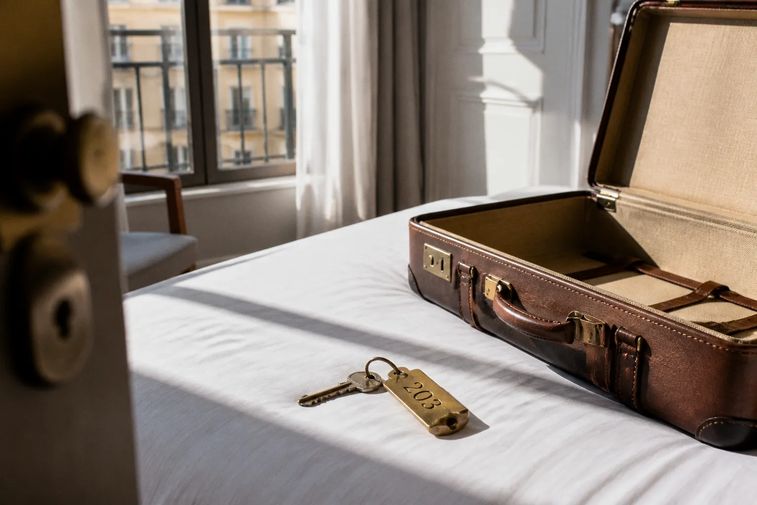
Hotel Booking Funnel Video: Three Strategic Placement Paths
More often, the video is placed at the wrong moment in the guest journey—on a social feed when the traveller is ready to compare rooms, or buried on a room page when the real hesitation is about what happens during checkout.
That distinction matters because video does not have one job. At the top of the funnel, it creates desire and recognition. In the middle, it gives shape to the stay—room proportions, breakfast atmosphere, pool access, the walk from the entrance to the beach. Near the booking button, it has a quieter but highly practical role: reducing uncertainty when the guest is already deciding whether to commit.
The most effective hotel booking funnel video placement follows those three moments rather than treating video as a decorative layer across the website.
Industry data suggests that 65% of travellers watch short-form hotel videos before booking, while 67% say they are more likely to complete a booking after watching a video tour. Those figures are useful, but only if we read them in context. A Reel can introduce the property. It cannot, by itself, answer every question that appears inside a booking engine. A room tour can build confidence. It cannot compensate for confusing rates, hidden fees, or a slow mobile checkout.
The work is not simply to add more video. It is to give each piece a precise place in the visual narrative of the booking journey.
The three placement paths at a glance
Before looking at each stage in detail, it helps to separate the roles clearly. The same film may be edited into several versions, but the guest should not be asked to make the same decision at every touchpoint.
| Funnel stage | Primary placement | Guest question | Best video role | Main conversion signal |
|---|---|---|---|---|
| Upper funnel | TikTok, Reels, metasearch discovery pages | Why should I notice this property? | Establish sense of place, mood, and distinctive experience | Qualified traffic and engaged visits |
| Mid funnel | Homepage hero, landing pages, room and amenity pages | Is this hotel right for my trip? | Show context, texture, layout, and real use of spaces | Room-page engagement and booking-engine entry |
| Lower funnel | Booking engine, room-selection step, checkout support | Am I choosing the right stay? | Resolve practical uncertainty and reinforce confidence | Completion rate, reduced abandonment, direct bookings |
This is the central alignment: the closer the traveller gets to purchase, the less the video should behave like an advertisement and the more it should behave like evidence.
The best booking video is not always the most cinematic one. It is the one that answers the question the guest is asking at that exact point in the journey.
Upper-funnel discovery: earning attention before the hotel is shortlisted
At the discovery stage, the traveller may not yet know the property’s name. They may be looking for a weekend in a particular neighbourhood, a family-friendly coastal hotel, or a design-led stay near a city centre. Their attention is moving quickly, and a video has only a moment to communicate why this place belongs in their consideration set.
This is where short-form content on TikTok, Instagram Reels, and metasearch environments can work well. The objective is not to explain every room category. It is to create a clear, recognisable impression of the stay.
A strong upper-funnel video usually gives the viewer three things:
- A sense of place—the relationship between the hotel and its destination, whether that is a walkable old town, a quiet stretch of coastline, or a business district with transport on the doorstep.
- A human reason to care—breakfast served in a sunlit courtyard, a late check-in that feels effortless, a family pool designed with actual family rhythms in mind.
- A visual signature—the material, colour, landscape, or spatial quality that makes the hotel distinguishable from the ten other properties appearing in the same search.
The mistake I see most often is trying to compress the entire property into fifteen seconds. The result is a fast sequence of bed, bathroom, pool, cocktail, lobby, aerial view, and logo—with no hierarchy. The viewer sees activity but does not understand the experience.
A better edit chooses one story. A city hotel might show the transition from street to lobby to room, making the property feel like a calm pause in a busy itinerary. A resort might focus on the relationship between room, terrace, pool, and shoreline. A boutique property might let architecture and local detail carry the narrative rather than forcing a generic sequence of smiling guests.
Social video is an awareness tool, not a booking-engine substitute
Traffic from social channels typically converts at much lower rates than traffic from brand search. The fact set places typical social conversion at 0.3% to 0.8%, while brand search sits between 4.2% and 7.8%. That gap is not evidence that social video has failed. It reflects the different intent of the visitor.
Someone arriving from a Reel may be curious, inspired, or casually saving a destination for later. Someone searching directly for the hotel is already carrying the property name and a stronger commercial intention. The video strategy should respect that distinction.
For upper-funnel content, measure whether the video brings the right people into the next stage:
- Are viewers reaching the hotel website rather than merely watching and moving on?
- Do landing-page visitors explore room or amenity pages?
- Does the traffic contain the right market, stay length, and traveller profile?
- Are viewers returning later through brand search or direct traffic?
- Which visual themes produce qualified visits rather than empty reach?
This is why I advise hotel teams to resist the temptation to judge every video by immediate bookings. Discovery content often contributes to a longer path. It should still be accountable, but its role is to create recognition and intent—not to perform the work of a checkout interface.
Mid-funnel engagement: where the visual narrative becomes useful
Once a traveller reaches the hotel website, the context changes. They are no longer asking only whether the property looks appealing. They are trying to establish whether it will work for their particular stay.
This is the point at which the answer to “where to put videos on a hotel website” becomes more specific. The homepage matters, but the highest-value placements are often the pages that sit closest to the guest’s actual uncertainty:
- Room category pages
- Family or suite landing pages
- Spa, pool, and dining pages
- Wedding and event pages
- Location pages connected to specific trip purposes
- Campaign landing pages built around a destination, season, or package
A homepage hero can establish atmosphere. A room-page video needs to establish truth.
The homepage hero: mood with direction
A homepage video should not make the booking interface difficult to find. Its purpose is to orient the visitor quickly and make the property’s positioning tangible.
The opening frame needs to work without sound, particularly on mobile. The visual should communicate the hotel’s character before the visitor has read a sentence, but the page should still provide a clear route into rooms, availability, and rates. Autoplay, if used, should be muted, compressed, and subordinate to the booking call to action.
The most effective hero videos usually avoid an overlong montage. They present a small number of connected moments:
1. Arrival or exterior context.
2. A distinctive shared space.
3. The room or stay experience.
4. A final frame that leads naturally toward booking or exploration.
That sequence gives the visitor an immediate sense of place without asking them to study the film. The page copy then carries the practical detail.
Room tours: making proportions and conditions visible
Room categories are where video can remove a particularly stubborn form of booking anxiety. Still photography can be beautiful while leaving practical questions unresolved:
- How far is the bed from the bathroom?
- Does the balcony feel usable or merely exist in the floor plan?
- Is the family room genuinely spacious enough for luggage and movement?
- Does the window face a street, courtyard, garden, or neighbouring wall?
- Is the walk-in shower separate from the bath?
- Can two adults move comfortably around the bed?
A room tour should not be a slow pan across styled furniture. It should be a visual answer to the guest’s imagined arrival. Begin at the entrance, show the movement through the room, and include the details that affect how the space will be lived in—storage, seating, bathroom access, terrace depth, and the relationship between zones.
This is especially important for room categories with similar names. “Deluxe,” “premium,” and “superior” can become an unhelpful vocabulary when the guest cannot see the meaningful difference. Video can clarify the hierarchy, but only when every category has a distinct narrative rather than a recycled edit with a different title.
Amenities need context, not catalogue footage
The same principle applies to amenities. A pool video should show more than water shimmering in sunlight. The guest may need to understand whether the pool is suitable for children, whether loungers sit in shade, how close it is to the rooms, or whether the atmosphere is quiet enough for a particular type of stay.
A dining video can communicate pace and setting—quick breakfast, long lunch, evening service—but it should not imply experiences that the property cannot consistently deliver. A spa film can show the transition from reception to treatment room and the quality of the environment, while the page copy handles treatments, opening hours, and booking conditions.
This is the difference between aesthetic content and conversion content. Aesthetic content makes the property desirable. Conversion content makes the decision feel safe.
If a guest has to imagine the scale, route, or use of a space, the hotel has left part of the sale to guesswork.
Lower-funnel conversion: placing video inside the booking engine
The booking engine is where many hotel websites lose the confidence they worked so hard to build. The guest selects dates, enters occupancy, compares rates, and then encounters a static interface that may look entirely disconnected from the website they just explored.
This transition is often jarring. The hotel has presented a coherent visual world, then sends the traveller into a white-label booking flow with unfamiliar navigation, limited room imagery, and little explanation of what distinguishes one offer from another.
Research in the provided benchmark indicates that up to 85% of travellers abandon the reservation process after starting the booking flow and selecting dates on static, non-video hotel booking engines. That figure should not be treated as a universal result for every platform or property, but it identifies a real point of friction: once guests begin comparing options, the absence of useful visual context can make the final choice feel riskier.
Where video belongs inside the booking flow
Video does not need to appear on every screen. In many cases, a restrained placement is more effective:
- Beside the selected room category, where the guest can confirm that the room matches the expectation created on the website.
- In an expandable room-detail panel, so the video supports comparison without pushing rates too far down the page.
- Near package or rate-plan descriptions when the offer includes a meaningful experience—breakfast, a private terrace, airport transfer, or spa access.
- On a booking-engine support panel for guests choosing between room types.
- In abandonment-recovery emails, where a short reminder of the stay can reconnect the guest with the original emotional reason for visiting.
The content should be short enough to support a decision, not delay it. A guest who has already selected dates does not necessarily want another ninety-second brand film. They may want a clear look at the room they are about to purchase.
A practical booking-engine video should prioritise:
- Room layout and visible dimensions
- Bed configuration
- Bathroom type
- Balcony, terrace, or view
- Accessibility features where relevant
- The difference between adjacent room categories
- The specific inclusions attached to the selected rate
The final point is often overlooked. If a rate includes breakfast or a flexible cancellation policy, the video should not be expected to explain that visually. But it can provide a confident visual frame for the offer, while the interface makes the commercial conditions easy to read.
Avoid turning the booking engine into a cinema
There is a natural temptation to place a large video background behind the room selector because it looks polished in a design presentation. That approach can create the opposite of alignment. The booking engine is a task environment. The traveller has arrived to make choices, and every visual element must help them do that with less effort.
A video that consumes the first screen, shifts the booking form below the fold, or plays automatically every time the guest changes a room may add friction rather than remove it. The right question is not whether the video looks impressive inside the interface. It is whether the guest can compare, understand, and confirm without losing their place.
The lower funnel rewards restraint. A thumbnail, expandable tour, or small inline player may outperform a full-width film simply because it preserves the booking task.
Comparing the three video placement paths
The three paths are connected, but they should not be judged by identical standards.
| Placement path | Strongest content | What it should not try to do | Useful tests |
|---|---|---|---|
| Social and metasearch discovery | Short, memorable sense-of-place films | Explain all room categories or close the booking alone | Hook, destination framing, landing-page clicks, qualified sessions |
| Website landing and room pages | Structured tours with spatial and practical detail | Replace written information about rates, policies, or accessibility | Play rate, room-page engagement, booking-engine starts |
| Booking engine and recovery | Concise decision-support clips | Distract from rate comparison or conceal commercial terms | Room selection, checkout completion, abandonment, assisted bookings |
This division also helps with production. One well-planned shoot can create a family of assets, but the edit should be rebuilt for context. The vertical discovery cut, the room-page tour, and the booking-engine clip may use the same source footage while serving entirely different jobs.
The technical reality: high-resolution assets versus site speed
The most beautiful video placement is commercially useless if the page takes too long to become usable. Hotel websites are already asset-heavy: large room photography, maps, booking widgets, tracking scripts, review integrations, and third-party tools all compete for the visitor’s attention and bandwidth.
Self-hosting uncompressed video directly on a basic hotel server is particularly risky. A 30-second 4K hero video can require approximately 67 MB before additional delivery considerations. That file size may be manageable in a controlled production workflow, but it is not a reason to place the original file directly into the page and hope the browser handles it gracefully.
A more considered delivery setup includes:
- Multiple resolutions and bitrates for different devices and connection speeds.
- A poster image that communicates the scene before the video loads.
- Muted autoplay only where it genuinely supports the page.
- Lazy loading for videos below the first screen.
- A visible play control when the guest has chosen to engage.
- Captions or on-screen context where sound carries meaning.
- A fallback image for browsers, accessibility settings, or restricted connections.
- A player that does not cover the booking button or interrupt date selection.
The technical choices should follow the guest journey. A social video can be edited for fast mobile consumption. A room tour on a desktop landing page can carry more detail. A booking-engine clip should be lightweight and immediate, because the guest has already expressed commercial intent and should not be forced to wait for the property to prove itself again.
The first frame is part of conversion design
Hotels often treat the thumbnail or poster frame as a production afterthought. It is not. The first visible image determines whether the guest understands what they are about to watch and whether the video appears relevant to their decision.
For a room tour, a wide but truthful frame may communicate the layout better than a close-up of decorative detail. For a pool video, the frame should reveal the setting and relationship to the property, not only a reflective surface. For a booking-engine clip, the opening should ideally identify the room or experience immediately.
This is a small design decision with an outsized effect on clarity. The guest should never have to wonder whether the player contains the room they selected.
Direct booking versus OTA performance: use video where margin matters
Hotels are right to care about video across discovery channels, but the commercial value becomes clearest when the traveller is guided toward the direct booking journey. Direct bookings captured through hotel websites carry an average profitability advantage of 18% to 20% compared with OTA-reserved stays. The exact result depends on commission structures, channel costs, room type, and promotional agreements, but the strategic direction is straightforward: a hotel that owns more of the guest relationship has more room to invest in experience and retention.
There is also a useful performance warning in the comparison between website and OTA conversion rates. Average hotel website conversion is reported between 1.5% and 3.9%, while OTAs achieve between 12% and 15%. These figures are not a simple contest between good and bad websites. OTAs aggregate enormous demand, benefit from habitual booking behaviour, and give visitors a familiar comparison environment. A hotel website must work harder to establish trust and make its specific value legible.
Video can help with that work, but it should not be asked to solve every weakness in the direct channel. If the hotel website has unclear room names, poor mobile navigation, unexpected taxes, limited payment options, or a booking engine that breaks the visual continuity of the brand, another film will not repair the guest journey.
The strongest direct-booking strategy combines visual confidence with commercial clarity:
- Show the room accurately before the guest reaches the booking engine.
- Carry the same room names, imagery, and terminology into the reservation flow.
- Make direct-booking advantages visible without hiding OTA conditions.
- Use video to explain spatial or experiential differences that text handles poorly.
- Keep cancellation, payment, occupancy, and inclusion details close to the rate choice.
- Retarget abandoned visitors with a relevant room or experience—not a generic hotel montage.
This is where video commerce for hotels becomes more than a content trend. It is an extension of merchandising. The hotel is presenting rooms and experiences as products, and the visual material should help the guest understand the product well enough to choose it.
A practical before-and-after pattern
In consulting work, I often see the same before-and-after shift—not a dramatic reinvention, but a correction in sequence.
Before, the hotel has a polished homepage film, usually placed above the booking form. The room pages contain attractive stills, but the categories are difficult to distinguish. The booking engine begins with dates and prices, then presents room names with limited visual support. The marketing team believes it has invested in video, yet the guest still has to make several important judgements alone.
After, the homepage film remains, but it is given a clearer job: introduce the hotel’s character and direct the visitor toward the right stay type. Room pages receive short, honest tours that show layout and context. Amenity videos are attached to the questions they answer. Inside the booking engine, selected room categories include compact clips and consistent imagery. The booking flow stays functional rather than theatrical.
Nothing in this structure promises a universal uplift percentage. That would be careless. The outcome depends on traffic quality, property type, brand recognition, seasonality, pricing, mobile experience, and the quality of the booking engine itself. But the guest journey becomes easier to follow because each video appears where uncertainty is most likely to surface.
That is the standard I would use when reviewing a hotel website: not “Where can we add video?” but “Where is the guest being asked to imagine too much?”
Building a hotel landing-page video strategy
A reliable strategy starts with the questions guests ask before they book. Those questions vary by property, but they usually cluster around a few practical themes:
- What does the room actually feel like at the scale shown in the photographs?
- Is the hotel suited to my trip—business, family, romantic, accessible, restorative, social?
- What is the relationship between the property and the destination?
- Which room category gives me the space or view I need?
- What will happen when I arrive?
- Why should I book directly rather than continue comparing elsewhere?
Map the videos to those questions, then map the questions to the funnel stage.
For example, a coastal resort may need a discovery film that establishes the shoreline and atmosphere, a landing-page film showing the relationship between villas and shared amenities, and booking-engine clips clarifying terrace size and bed configuration. A business hotel may need less lifestyle footage and more evidence of arrival efficiency, workspace quality, breakfast timing, and room functionality. A design hotel may attract attention through architecture, but conversion will still depend on whether the guest can understand the room categories and the practical experience of staying there.
The production brief should therefore include the booking context, not only the shot list. Ask what the guest is deciding, what the video must prove, and what the page needs to do immediately after the video ends.
A simple prioritisation order
When budgets are limited, I would prioritise in this order:
1. Room-category clarity. If guests cannot distinguish the products they are buying, start there.
2. High-intent landing pages. Build videos around the room types, packages, and experiences that already attract meaningful demand.
3. Booking-engine continuity. Make sure the selected room still looks and feels like the room the guest saw on the main website.
4. Homepage atmosphere. Refine the hero once the practical decision points are supported.
5. Upper-funnel volume. Expand social and metasearch variations after the destination and direct-booking journeys are ready to receive the traffic.
This order may feel less glamorous than beginning with a flagship brand film, but it is usually more useful. A hotel does not need to stop telling its story. It needs to tell the right part of the story at the right moment.
The final alignment
Hotel booking funnel video placement is not a choice between social, website, and booking engine. It is a sequence across all three.
Use upper-funnel video to earn attention and make the property recognisable. Use mid-funnel video to show the guest what the stay will actually feel like—its spaces, proportions, routes, and details. Use lower-funnel video to confirm the decision without interrupting the booking task.
The strongest visual narrative is not the one with the most footage. It is the one that carries the guest from curiosity to confidence with the least unnecessary guesswork.
That is the difference between video as decoration and video as conversion infrastructure. One makes the hotel look good. The other helps the right guest choose the right stay—and complete the booking on the hotel’s own terms.