Room comparison videos: three layout traps that kill bookings
Direct hotel bookings account for roughly 20% of hotel revenue globally. The acquisition cost is materially lower than OTA commission: around 4.25–4.5% versus 18–25%.
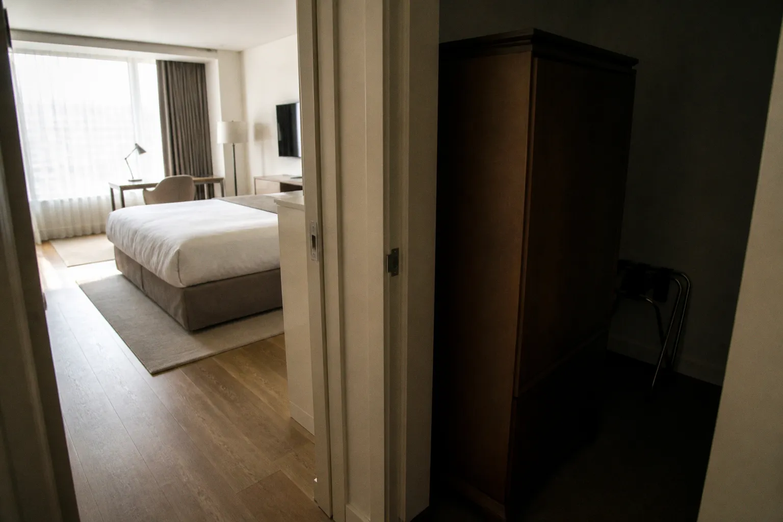
That makes the hotel website a revenue channel, not a brochure.
The average hotel website converts only 1.5–2.5% of sessions. Sessions that reach the booking engine convert at a higher rate, typically 8–15%. The gap is the audit target. Video can narrow it. Poor video layout can widen it.
Room comparison clips create a specific risk. They show more inventory detail, but they also introduce more interface weight, more scroll distance, and more opportunities to hide the booking CTA. The result is a familiar conversion failure: the visitor understands the rooms, then leaves before selecting one.
The first trap: the video player covers the booking CTA
The booking call to action has one job. It must remain visible at the moment the visitor has enough information to act.
A room comparison video often interferes with that sequence. The player is placed above or beside the booking engine. It expands on interaction. It loads a control layer. It pushes the rate selector below the fold. On mobile, the effect is worse. The user sees the room. The user does not see the action.
This is not a design preference. It is a path-length problem.
A hotel landing page usually asks the visitor to move through several decisions:
1. Confirm the property.
2. Select dates.
3. Check availability.
4. Compare room categories.
5. Choose a room.
6. Enter guest and payment details.
Room video belongs near step four. The booking engine must remain available between steps three and five. If the video becomes a full-screen destination, the interface breaks the booking sequence.
What the failure looks like in analytics
The page can appear healthy in a standard report. Sessions remain high. Video plays increase. Time on page rises. None of these metrics prove commercial value.
The useful signals are closer to the booking path:
- A high video start rate with a low booking-engine click-through rate.
- A drop in room-selection events after the video component is introduced.
- Mobile users reaching the video section but not reaching the rate or availability controls.
- A high exit rate after video interaction.
- A difference between booking intent conversion on desktop and mobile.
- Repeated scrolling around the player and CTA area in a heatmap or session recording.
A video can increase engagement while reducing bookings. This is not a contradiction. Engagement is not the conversion event.
A room video that delays the booking action is not a sales asset. It is a navigation obstacle with a play button.
The layout pattern that usually fails
The most fragile structure is a large video player positioned directly above the booking widget, with no persistent CTA and no visible room-selection control. The visitor must watch, close, scroll, and locate the next action.
The same problem appears in side-by-side comparison layouts. Two or three players sit in parallel columns. Each player has its own controls. On smaller screens, the columns stack. The booking control moves further down the page with every additional clip.
The layout creates three forms of friction:
- Visual friction: the screen is dominated by playback controls instead of room choice.
- Interaction friction: the visitor must close or dismiss the player before continuing.
- Decision friction: the comparison shows differences without providing a direct route to availability.
The booking engine room selection video should support a decision, not replace the decision interface. A room card needs a clear route from visual evidence to action. That route can be a rate button, a room-category selector, or a persistent booking bar. It cannot be an implied next step.
The second trap: mobile video assets consume the booking path
More than 52% of travelers research hotels on smartphones. Among millennials, 66% complete hotel bookings on mobile devices. Mobile is not a reduced desktop channel. It is a primary booking environment.
The technical failure is usually predictable. The desktop page is built around a wide comparison grid. The mobile version stacks the components. The video remains large. The content order stays intact. The booking engine is now below multiple clips, descriptions, amenities, and rate blocks.
This is responsive in the narrow technical sense. It is not optimized for conversion.
File weight changes the first interaction
An uncompressed 4K clip can reach about 67 MB. A 1080p clip can still reach roughly 16 MB. A page with several room videos can therefore create a substantial loading burden before the visitor reaches the booking control.
Self-hosting without a dedicated CDN adds another point of failure. Delivery speed depends on server configuration, geographic distance, concurrent demand, and the way the player requests the media. The visitor does not see any of that. The visitor sees a blank space, a stalled poster image, or a layout that shifts while the player initializes.
The conversion cost is not limited to the video itself. Heavy media can delay:
- The first meaningful room image.
- The booking form becoming interactive.
- The date picker responding to input.
- The price and availability request.
- The sticky CTA appearing.
- The browser completing the page layout.
The result is a high-friction booking path. A visitor who arrived with booking intent can lose that intent before the page becomes usable.
Mobile layouts need a different content hierarchy
A mobile room comparison should not be a compressed desktop comparison. It needs an explicit order of operations.
A workable sequence is:
1. Show the room name, occupancy, key differentiator, and starting action.
2. Keep the booking or availability control visible.
3. Load a poster frame before the video.
4. Let the visitor initiate playback.
5. Keep the clip short enough to support comparison rather than become a separate viewing session.
6. Return the visitor to the same room card after playback.
7. Preserve selected dates and room state.
The video should answer one question at a time. Does the room have a separate living area? Is the balcony usable? Is the second bed a sofa bed or a full bed? Is the bathroom layout materially different? A general montage is harder to use because it creates visual activity without reducing uncertainty.
Compare the mobile and desktop failure modes
| Layout decision | Desktop effect | Mobile effect | Conversion risk |
|---|---|---|---|
| Large autoplay video | May dominate the hero area | Can occupy most of the first screen | CTA is displaced before the visitor acts |
| Side-by-side room players | Supports fast visual comparison | Often stacks into a long scroll | Room selection becomes separated from availability |
| Full-screen player expansion | Feels manageable on a wide display | Hides the booking context | Visitor loses date, rate, and room state |
| Multiple high-resolution clips | May load within acceptable time | Increases transfer and rendering load | Bounce rate and interaction delay rise |
| Video below the room card | Supports detail review | Pushes the next room far below | Comparison becomes slow and repetitive |
The important distinction is not video versus no video. It is controlled media versus uncontrolled media.
The third trap: the clips create false room expectations
The most expensive hotel room video mistake is not always technical. It can be visual.
A room clip can be sharp, stabilized, and correctly exposed. It can still misrepresent the product. The issue appears when the video uses a different focal length, camera height, crop, or lighting condition from the images and room descriptions around it.
The visitor builds a spatial model from the page. If the video implies a wider room than the guest receives, the booking decision becomes unstable. The problem often surfaces later as dissatisfaction, complaints, or negative review language. The booking may still convert. The expectation has not.
Focal length changes perceived room size
A wide focal length exaggerates spatial continuity. It makes the distance between the bed, desk, and window appear more generous. A camera placed close to a corner can produce a clean view of three walls while concealing the usable floor area.
The opposite problem also exists. A narrow crop can hide a structural limitation:
- A bed placed directly against a wall.
- A restricted balcony.
- A low ceiling section.
- A bathroom entrance that opens into a tight corridor.
- A sofa bed occupying the primary circulation path.
- A partial obstruction from a column or wardrobe.
A room comparison video must use a consistent visual method. The camera height, lens behavior, movement speed, and framing should not change arbitrarily between categories. Otherwise the comparison measures production choices rather than room differences.
Dynamic range can hide material defects
Hotel interiors often contain high-contrast scenes. Bright windows sit beside dark beds. Bathrooms combine reflective tile, mirror surfaces, and low ambient light. A camera with limited dynamic range clips highlights or crushes shadows. The room may look clean in the video while important details disappear.
That matters for conversion because room selection depends on evidence. The visitor needs to see:
- The actual window position and view.
- The amount of daylight reaching the bed.
- The bathroom finish and storage.
- The relation between furniture and walking space.
- The condition of upholstery, flooring, and fixtures.
- The difference between a standard and upgraded room.
High dynamic range is not a substitute for accurate representation. It is a control against lost information. The image should not turn into a synthetic version of the room.
A comparison clip needs controlled visual standards
Before publishing multiple room videos, define the production parameters. This is not a creative brief. It is a measurement system.
Use consistent rules for:
- Camera height.
- Horizontal and vertical correction.
- Focal length or field of view.
- Exposure limits near windows.
- White balance across rooms.
- Clip duration.
- Opening frame.
- Movement speed.
- Overlay labels.
- Thumbnail crop.
- Audio behavior.
- Caption treatment.
The last item is operationally important. Autoplay with sound is disruptive and often blocked by browsers. Autoplay without sound can function as a visual preview, but it must not obscure the CTA or create a false impression of what is being shown.
Do not turn comparison into a catalogue of player controls
The purpose of comparison is to reduce uncertainty. A page with six separate players may provide more footage and less clarity.
Visitors rarely need a full room tour for every category. They need the differences that affect selection. A useful comparison system prioritizes high-value variables:
- Bed configuration.
- Occupancy.
- Floor area.
- View type.
- Balcony or terrace access.
- Bathroom configuration.
- Separate living space.
- Accessibility features.
- Connecting-room availability.
- Rate conditions.
The video should reinforce these variables. It should not force the visitor to infer them from a slow camera sweep.
Use the room card as the control surface
The room card should remain the primary unit. Video is a component inside that unit.
A strong room card can contain:
- A poster frame with a descriptive label.
- A short clip focused on the room’s differentiator.
- A compact comparison line.
- The current availability or rate action.
- A secondary link for the full room detail.
- A persistent relationship between selected dates and the room category.
This arrangement reduces context switching. The visitor does not move from a marketing video to a separate booking system with no memory of the chosen room.
The interaction should also preserve state. If a visitor selects dates, opens a room video, and returns to the card, those dates should remain selected. If the visitor opens a comparison panel, the panel should close without resetting the room list. State loss creates friction that is easy to miss in a desktop review and obvious on a phone.
Side-by-side versus single-player comparison
The layout decision depends on the number of rooms and the importance of direct visual contrast.
| Comparison model | Best use | Main benefit | Main failure mode |
|---|---|---|---|
| Single player with room selector | Several similar categories | Limits page weight and keeps one viewing area | Selector can hide the room differences |
| One clip per room card | A small set of materially different rooms | Keeps evidence close to the booking action | Page becomes long and heavy |
| Side-by-side players | Desktop-only comparison of two high-priority categories | Makes visual differences immediate | Collapses poorly on mobile |
| Thumbnail strip with one active player | Large inventory set | Controls media requests and screen density | Requires clear labels and active-state feedback |
| Short clip plus still-image gallery | Rooms with one or two critical differentiators | Preserves speed and detail | Can under-explain complex layouts |
There is no universal winner. The test variable is not merely click-through on video. Measure the full path to room selection and booking-engine entry.
The conversion test must isolate layout, not just content
Hotel website video conversion often gets evaluated with a weak experiment. The team changes the footage, poster, copy, room order, and CTA at the same time. The result is uninterpretable.
A useful split-test isolates one structural change:
- Video above the room card versus inside the room card.
- Persistent booking CTA versus standard button placement.
- Autoplay preview versus click-to-play.
- One active player versus multiple simultaneous players.
- Video-first mobile layout versus room-detail-first layout.
- Full-room tour versus differentiator-led clip.
- High-resolution source with adaptive delivery versus a single large file.
The primary measure should be the next commercial action. Depending on the implementation, that may be booking-engine entry, room selection, rate selection, or completed booking. Video plays are supporting metrics.
A practical measurement table looks like this:
| Metric | What it detects | What it does not prove |
|---|---|---|
| Video start rate | Whether the preview attracts interaction | That the clip improves bookings |
| Video completion rate | Whether the content holds attention | That the room became more desirable |
| Booking-engine click-through | Whether users move toward availability | That they completed a reservation |
| Room-selection rate | Whether the comparison supports choice | That the chosen room met expectations |
| Mobile abandonment | Whether the mobile path loses users | Which component caused the loss |
| Page load and interaction delay | Whether media creates technical friction | Whether the footage itself is persuasive |
| Completed booking rate | Commercial outcome | Why the result changed without segmented analysis |
Segment the result by device, traffic source, new versus returning visitor, and room category. A layout that works for desktop direct traffic may fail for paid mobile traffic. A clip that helps an upgraded suite may be irrelevant for a standard room.
The unknown must remain explicit: there is no reliable basis for claiming a fixed percentage drop caused specifically by a side-by-side player layout. That effect must be measured on the actual site, with the actual booking engine and audience.
Do not assign revenue impact to a video layout from video engagement data. The booking path is the measurement boundary.
Delivery architecture: preserve fidelity without making the page wait
The media pipeline determines whether the page supports or obstructs conversion.
A high-fidelity room video should be delivered as a controlled asset, not uploaded as a master file and placed directly into the page. The production file and the web delivery file have different purposes. The web version needs an intentional resolution, bitrate, poster, and loading behavior.
The baseline controls are straightforward:
- Use a dedicated CDN for video delivery where the platform supports it.
- Serve adaptive variants rather than one oversized file.
- Avoid loading every room clip on initial page render.
- Use poster images that communicate the room accurately.
- Lazy-load clips below the first viewport.
- Reserve player dimensions to prevent layout shift.
- Compress without destroying fine detail in dark interiors.
- Test on mobile networks, not only office Wi-Fi.
- Keep the booking CTA available before media playback begins.
- Log player errors and delayed initialization.
A poster frame is not a decorative thumbnail. It is the first representation of the room. It needs to show the feature that distinguishes the category. A balcony room should not use a generic bed crop if the balcony is the selection reason. A family room should not hide the second sleeping area. The poster must be informative at small dimensions.
Do not use video to solve weak room information
A video cannot repair inconsistent room data. If the room area, bed type, view, and occupancy are missing or contradictory, the visitor will not extract reliable information from a moving image.
The page should align four layers:
1. Text: the room category and measurable attributes.
2. Still images: stable views for detail inspection.
3. Video: movement, spatial continuity, and room relationships.
4. Booking interface: availability, rate, conditions, and selection.
When these layers disagree, the page creates friction. The visitor has to reconcile the data manually. That is a conversion leak.
A common example is a video showing a sofa bed while the room card lists only one bed. Another is a clip recorded in a staged room while the booking engine allocates a room with a different view or layout. The page may convert. The expectation mismatch remains embedded in the transaction.
Placement strategy: put evidence beside the decision
The best location for a room comparison video is the point where the visitor is choosing between categories. This usually means the room-selection area, not an isolated visual hero at the top of the page.
The hero can establish property identity. It should not consume the entire first interaction if the commercial objective is direct booking. The booking CTA and date controls need to compete successfully with the visual asset. Heavy motion and large playback surfaces naturally win that competition.
A practical hierarchy is:
- Booking dates and availability near the top.
- Room category cards immediately after availability or alongside it.
- Video embedded within the relevant room card.
- Detailed gallery or full tour available as a secondary action.
- Persistent booking control on mobile.
- Comparison tools that do not reset room or date state.
This creates a short evidence-to-action path. The visitor sees the room difference, confirms the rate, and selects the category without navigating to a separate content layer.
The layout audit
Run the audit on the actual booking flow. Do not review only the CMS preview or desktop homepage.
Check the following in sequence:
- The booking CTA is visible before the video loads.
- The CTA remains visible after playback starts.
- The player does not cover the date selector or room action.
- The room name and category remain visible during video interaction.
- The selected dates persist after opening and closing the player.
- The video poster matches the room category.
- The room shown is the room sold by the connected inventory.
- Mobile users can reach availability without passing every clip.
- The page reserves space for the player and does not jump during load.
- Video files are delivered in appropriate variants.
- The first room comparison action works on a slow mobile connection.
- A user can return from the video to the exact decision point.
- The room card does not depend on sound to communicate its key difference.
- Analytics distinguish video interaction from booking-engine interaction.
- The experiment reports room selection and booking outcomes, not only plays.
If one of these conditions fails, the issue is not cosmetic. It belongs in the conversion backlog.
The technical conclusion
Hotel room video comparison mistakes usually come from treating video as a content layer instead of an interface component. The footage is evaluated for sharpness, stabilization, and production quality. The page is not evaluated for friction.
That is the wrong order.
Start with the booking path. Keep the CTA visible. Reduce mobile asset weight. Use consistent focal length and camera standards. Show the differences that affect room selection. Preserve state. Measure the movement from video interaction to booking-engine entry and completed booking.
Direct booking has a lower acquisition cost than OTA distribution. The website therefore has a clear financial role. A room video earns its place only when it improves that channel without slowing it down.
Final technical checklist:
- CTA: visible before, during, and after video interaction.
- Mobile: no stacked player wall between the visitor and availability.
- Asset delivery: compressed, adaptive, lazy-loaded, and CDN-supported where required.
- Representation: focal length, camera height, exposure, and room layout remain credible.
- Comparison: clips expose meaningful category differences.
- State: dates, room choice, and booking context survive player interaction.
- Measurement: split-test results include room selection and booking conversion.
- Expectation control: the video matches the inventory actually sold.
If the video improves visual confidence and shortens the route to room selection, it is doing conversion work. If it increases scrolling, delays interaction, or hides the booking action, it is a conversion leak.