Room page video formats: three paths to conversion
Here’s what I see when I audit a hotel’s booking funnel, week after week, across independent boutiques and small chains: a beautifully shot hero image on the homepage, a thoughtful brand narrative, a clean rate calendar — and then the room page.
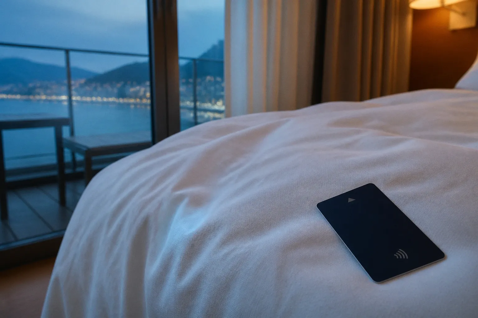
The $7,200 Question Hiding on Your Room Page
That single screen is where the entire booking journey either pays off or quietly leaks.
Compare car rental deals in United Kingdom
See available offersPartner link — DiscoverCars comparisonThe average hotel website converts somewhere between 1.5% and 2.5% of visitors, and that number has barely budged for most properties I’ve consulted with over the past several years. What does move the needle — consistently, measurably — is what happens when a guest lands on the actual room they are considering spending the night in.
I’ve watched properties double their direct booking share by changing almost nothing on their site except the way they present the room itself. Not the price, not the rate parity, not the loyalty pitch — the visual proof of what the guest is buying. The format of the video on that room page is no longer just a creative decision. It is a revenue decision, and the wrong choice costs real money every month.
The room page is not a brochure. It is the last thirty seconds of consideration before a guest types a credit card number — or closes the tab.
So let’s talk honestly about the three hotel room page video formats that actually earn their place in the booking funnel, and where each one works best.
The 129% Shift: Why Interactive 360-Degree Tours Dominate Room Pages
When a property adds an interactive 360-degree virtual tour to its room page, the conversion number jumps from roughly 2.1% to about 4.8% — a 129% relative lift. That figure is not a projection. It is the consistent pattern across the independent hotels and small groups I’ve worked with, and it matches what broader industry data keeps showing. Even more telling, the source of bookings shifts: without a virtual tour, only about 34% of bookings come through direct channels while 66% leak to OTAs. With a tour embedded on the room page, direct share climbs to roughly 62%.
The numbers matter, but the mechanism matters more.
A 360-degree tour hands the guest control. They can pan around the bed, check the window view, inspect the bathroom tiling, look at the distance between the bed and the desk, and decide for themselves whether the room is worth the rate. That act of self-directed exploration is what converts consideration into commitment.
A photograph tells a guest what the room looks like from one carefully selected angle. A traditional video tells them what the hotel wants them to notice. A virtual tour lets them ask their own questions.
Is the room genuinely bright, or was it lit for the shoot? Does the bathroom feel spacious enough for two people? Is there room to open a suitcase beside the bed? Can the guest see the balcony from the sleeping area? Is the “city view” visible from the room itself or only from a carefully framed corner?
Those questions are not minor details. They are often the difference between confidence and hesitation, particularly when the room is expensive, the stay is important, or the guest is comparing several properties that look similar in a listing grid.
Dwell time on listing pages with interactive tours runs 5 to 10 times longer than pages without them, and those extra seconds are not idle scrolling. They are the guest quietly convincing themselves. They are also the point at which uncertainty becomes something the page can resolve rather than something the booking engine leaves to an OTA review section.
A/B testing data bears this out: interactive 360 tours on room selection pages produce a relative conversion lift of 9% to 18%, and look-to-book ratios can climb anywhere from 16% to 67%. The Radisson chain, across several properties, saw online revenue rise by 135% — roughly $7,200 per hotel per month — after rolling out virtual tours. That is not a vanity metric. That is the kind of number that justifies the entire content budget for the year.
There is, however, an important distinction between a useful virtual tour and an expensive piece of digital furniture.
The tour needs to represent the room honestly. If the camera height is strange, the lens is too wide, or the stitching makes the room appear larger than it is, the guest will notice the mismatch when they arrive. The short-term booking may still happen, but the property has created a post-arrival disappointment that no conversion report will capture cleanly.
The tour also needs clear navigation. Guests should be able to move from the bed to the bathroom to the view without fighting the interface. Room labels, hotspots, floor indicators, and an obvious way to return to the booking path all matter. The best tour is immersive without becoming a maze.
The honest caveat is that 360 tours require production investment, decent page-load discipline, and a clear understanding of the traffic they are serving. They reward desktop and tablet traffic particularly well, but they can also work on mobile when the experience is built around progressive loading and sensible interaction. On a five-year-old mobile device connected to a congested hotel Wi-Fi network, a poorly optimized tour can stall — which is the exact moment you lose the booking.
Cinematic Walkthroughs: Building Emotional Connection Through Narrative
There is a different kind of decision being made on a room page, and the 360 tour does not always serve it.
When a guest is booking a boutique suite, a design-forward property, or any room where atmosphere is the product — the texture of the linens, the way late afternoon light crosses the floor, the small ceremony of unlocking the door — what they need is not exploration. They need to feel something.
That is where the cinematic walkthrough earns its place.
A two- to four-minute narrative cut — a steady movement through the doorway, a slow push across the bed, a deliberate pause at the window — sells the sensory promise of the room in a way no interactive tour can. The goal is not to document every corner. The goal is to establish a sequence of impressions that makes the room feel like part of a stay rather than a collection of specifications.
A cinematic walkthrough can show the room opening into the morning, the reading chair positioned beside the window, the materials chosen for the bathroom, and the relationship between the room and the rest of the property. It can establish whether the hotel feels quiet, social, polished, playful, residential, or deliberately removed from the pace of the surrounding city.
That emotional information is particularly valuable for properties whose price is not explained by square footage alone.
A static room carousel cannot create that progression. A 360 tour cannot choreograph it. Only the cinematic walkthrough lets you control the emotional sequence the way a short film would.
This is also where brand storytelling lives. You can show the local neighborhood in the opening ten seconds, hint at the café downstairs, bring in the courtyard, or connect the room to a wider sense of place. A guest booking a stay at a design hotel is not only buying a bed. They are buying the feeling that the property belongs to a particular city, coastline, landscape, or way of living.
The format becomes especially effective when the room itself has a narrative feature:
- A suite built around a terrace or private garden.
- A historic room where original architectural details justify the rate.
- A family room whose layout solves a practical problem.
- A resort villa where indoor and outdoor spaces are inseparable.
- A compact city room whose design makes limited space feel intentional rather than restrictive.
The trade-off is honest: a cinematic walkthrough will not necessarily lift raw conversion rate in the same way a 360 tour can. Its commercial value often appears elsewhere. It can support average daily rate, length of stay, direct-booking share at full price, and the guest’s willingness to select a better room rather than defaulting to the cheapest available category.
That makes the walkthrough a poor replacement for visual proof but a strong companion to it. The 360 tour answers, “What exactly am I getting?” The cinematic video answers, “What will it feel like to stay here?”
I’ve seen properties pair both formats and watch the two assets do different jobs without competing with each other. The tour handles inspection. The walkthrough handles desire. The booking page needs both when the property is selling more than basic accommodation.
There is one production rule I would not compromise on: do not make the cinematic cut so polished that it becomes evasive. Leave enough visual space for the guest to understand the room’s actual proportions. A slow camera movement is useful; a sequence of abstract close-ups that never reveals the full room is not. Atmosphere should add confidence, not conceal the product.
The Mobile-First Imperative: Leveraging Short-Form Vertical Video
Now we have to address the uncomfortable truth in the room. Roughly 62% of hotel website visits come from mobile devices, and the median mobile conversion rate sits around 1.4% — less than half the 2.9% desktop rate. The gap is not because mobile users are less serious. It is because most hotel room pages were designed for a desktop browser and then grudgingly adapted for a phone.
The video formats that work on a 27-inch monitor often feel sluggish, unplayable, or simply out of place on a 6.1-inch screen held vertically. A guest may discover the hotel through a social post, compare rooms on a phone, check the dates in a booking engine, and make the final decision while standing in an airport queue. The page has to work inside that behavior rather than demanding a more convenient one.
Short-form vertical video — the 15- to 60-second walkthrough cut designed for Reels, TikTok, and Shorts — solves the placement problem elegantly. Engagement rates can run up to 4.7 times higher than static photo ads in hospitality campaigns, and the format behaves the way mobile guests already consume content: thumb-scroll, full-bleed, sound-optional, and captioned.
But here is the discipline that separates the properties winning with vertical video from the ones wasting production budget.
Vertical video on a room page is not a social media post embedded into the page. It is a tightly choreographed walkthrough: entry, bed, window, bathroom, one meaningful detail, and a clear route to the next action. It should be designed to load quickly on a mobile connection and play on mute by default. Think of it as the room page’s trailer, not its documentary.
The first few seconds need to establish context. If the video opens on an indistinct close-up of a lamp or a decorative object, the guest has no reason to keep watching. Start with the room’s strongest spatial promise: the view from the doorway, the connection between the bed and the window, the terrace, or the feature that makes this category different from the one below it.
Captions should carry the essential meaning without turning the screen into a paragraph. “Separate living area,” “corner room,” “walk-in shower,” and “private balcony” are more useful than vague claims about luxury or comfort. The guest is already trying to understand whether the room fits their trip. Give them information they can use.
The vertical cut should also be specific to the room category. One generic hotel video placed on every room page weakens the whole architecture of the site. A guest comparing a standard king room with a junior suite needs to see the difference between those products, not the same sequence of lobby, cocktail, bed, and pool footage.
That does not mean every room needs an entirely new production. A single shoot can generate multiple edits if the production is planned around modular footage. Capture the room wide, the defining detail close, the view, the bathroom, and the movement between spaces. Then create a short edit for discovery, a more complete edit for the room page, and still frames that can support the booking interface.
One note from the field: vertical video is not a substitute for the longer formats. It is the front door. The guest who arrives via vertical video and stays for the 360 tour is the highest-intent visitor on the page, and that sequence shows up clearly in the analytics.
Short-form video gets the guest to stop. The room tour gives them a reason to stay. The booking engine should not be asked to do either job.
Bridging the Conversion Gap: Balancing Load Speed and Visual Impact
Every hotelier I work with asks the same second question after we discuss video formats: Will this slow my page down?
The answer is yes if you do it badly, and no if you treat your video assets like the revenue infrastructure they are.
The single biggest mistake I see is uploading raw 4K or 8K video files directly to the room page and letting the booking engine figure it out. Unoptimized video can make the page feel slow, delay the moment when the guest sees useful content, and increase abandonment before the room has had a chance to sell itself. A page that looks spectacular in a desktop review can be functionally broken for a guest on a mobile connection.
The right approach is layered:
1. Use a lightweight first impression. The initial room-page visual should load quickly and communicate the room category before the heavier assets are requested.
2. Keep cinematic video behind a deliberate play action. Do not force a multi-minute file to load before the guest has shown any interest in watching it.
3. Stream interactive tours progressively. The guest should be able to begin exploring without waiting for the entire experience to arrive at once.
4. Serve the right resolution to the right device. A mobile visitor does not need the same file as a large desktop display.
5. Keep controls obvious. Play, pause, mute, close, and return-to-booking actions should not be hidden inside a decorative interface.
6. Test the complete booking path. The room page may load quickly while the embedded tour, rate calendar, or booking widget introduces the real delay.
The visual hierarchy matters as much as the file compression. The heaviest asset should not automatically be the most prominent asset. The guest needs to understand the room first, then choose how deeply to explore it.
A useful room page often works as a sequence:
- A clear room image or lightweight video preview establishes the category.
- A short vertical cut communicates the room in a mobile-native format.
- A cinematic walkthrough builds atmosphere for guests who are still choosing between properties.
- A 360 tour resolves practical uncertainty for guests who are comparing room types.
- The booking module remains visible and easy to reach throughout the process.
This sequence respects the difference between attention and intent. Not every visitor wants an immersive tour. Some are returning guests who need only the rate and dates. Others are deciding whether the room is suitable for a child, a wheelchair, a work trip, or a special occasion. The page should allow each visitor to take the shortest route to confidence.
Structured metadata matters more than most operators realize. Pages with optimized video content and proper YouTube integrations are 53 times more likely to surface on the first page of Google — which means your video assets are doing double duty as conversion tools and as search infrastructure. Whatever publishing approach you use, the fundamentals remain the same: describe the video accurately, provide a useful thumbnail, include captions where appropriate, and make sure the visible page content still explains the room without relying on playback.
Accessibility is part of conversion, not a separate courtesy. Autoplay with sound is a poor experience. Tiny controls are a poor experience. Video that contains the only explanation of a room feature is a poor experience. Captions, descriptive text, keyboard-friendly controls, and a sensible fallback image help more guests understand what they are being shown.
The same principle applies to privacy and consent requirements. A hosted player, tracking script, and third-party tour platform may introduce technical or legal considerations that the creative team never sees. Bring the web, revenue, and marketing teams into the conversation before the room page is rebuilt, not after the first complaint about performance.
Strategic Implementation: Matching Video Assets to Guest Intent
Here is the practical comparison I walk every hotelier through when we sit down to plan a room page refresh. These are not interchangeable formats. Each one serves a different stage of the guest decision, and the right mix depends on your property type, your traffic profile, your room inventory, and where you sit in the price ladder.
| Format | Best for | Ideal length | Conversion impact | Production cost | Mobile performance |
|---|---|---|---|---|---|
| Interactive 360° virtual tour | Independent hotels, urban boutiques, and mid-luxury properties where guests compare rooms closely | Self-paced, typically 60–90 seconds to explore | 129% relative lift on booking conversion; direct share rises from 34% to 62% | Moderate to high, with specialist capture and hosting | Weak if unoptimized; strong with progressive streaming |
| Cinematic walkthrough | Design-led properties, suites, resorts, and rooms sold primarily on atmosphere | 2–4 minutes | Supports ADR and direct-booking share at full price; complements other formats | Moderate, usually a videographer plus editor | Acceptable with compressed delivery; better on Wi-Fi |
| Short-form vertical video | Mobile-heavy traffic, social-driven discovery, and the first impression on the room page | 15–60 seconds | 4.7× engagement over static ads; front-funnel attention that feeds longer formats | Low to moderate, using one operator with a phone or compact rig | Excellent when designed for the medium |
The table is useful only if it leads to a decision. The most common mistake is choosing a format because it looks impressive in a creative review rather than because it solves a specific booking problem.
Choose the 360 tour first when guests regularly ask what distinguishes one room category from another. This is common in hotels with several similar room types, unusual layouts, city-view claims, or meaningful differences in balconies, bathrooms, and sleeping arrangements. If the property’s main obstacle is uncertainty, let the guest inspect the product.
Choose the cinematic walkthrough first when the room is part of the property’s emotional proposition. This is often the case for boutique hotels, resorts, heritage buildings, and high-rate suites. If guests are buying design, privacy, ritual, or a particular sense of place, a purely functional tour will leave value on the table.
Choose the vertical cut first when mobile discovery is the biggest gap. It is the most efficient way to adapt existing visual assets for social traffic and mobile room-page behavior, provided the edit is specific, fast, captioned, and connected to the right room category.
Guest-generated content has a place here too, but it should not be confused with the primary room presentation. A guest UGC clip can provide social proof around the experience of staying in the room: the morning light, the view at night, the ease of working from the desk, or the reaction to a particular design detail. It is persuasive because it feels less controlled.
It is not reliable as the only source of room information. Guest footage may omit the bathroom, distort proportions, use poor audio, or show a room after personal belongings have changed the visual impression. Use UGC to support trust and relatability, while the hotel’s own room video provides the factual foundation.
The same goes for social clips from creators. A creator may produce excellent awareness content that sends qualified traffic to the property, but the room page still needs to answer practical questions in the hotel’s own visual language. Discovery content and decision content can share footage. They should not be expected to serve precisely the same purpose.
A sensible rollout
The implementation sequence I recommend after watching this work across multiple properties is straightforward. Start with the vertical short-form cut on mobile because it is usually the cheapest and fastest asset to deploy. Then commission the cinematic walkthrough for the rooms that carry the highest rates or the strongest design story. Finally, layer in the 360 tour on the categories that guests comparison-shop most heavily — typically the standard room, the most confusing set of room types, and the flagship suite.
That order respects cash flow without pretending that every asset has the same commercial role.
Before production, review the questions guests are already asking. Search messages to the reservations team. Read the questions in OTA reviews. Look at where users leave the room page and where they return to the room list. If guests repeatedly ask whether a sofa bed is in a separate area, whether the balcony is private, or whether the bathroom has a bathtub, those questions should influence the shot list.
After publishing, measure more than plays. Look at:
- Movement from the room page to the booking engine.
- Room-category upgrades after video interaction.
- Direct versus OTA booking behavior.
- Engagement by device and connection type.
- The point at which guests abandon the page.
- Whether video viewers book at a higher rate or simply spend more time browsing.
- Post-stay feedback that indicates a mismatch between the video and the actual room.
A video that generates a high play count but no movement toward booking may be entertaining the wrong audience. A tour with modest interaction but a strong upgrade rate may be doing exactly what the property needs. The useful metric is not “how many people watched?” It is “what uncertainty did the asset remove, and what did the guest do next?”
The three formats are not competitors. They are a layered narrative, and the room page performs best when each guest finds the entry point that matches how they make decisions.
The 360 tour is the closest thing to an in-person visit the booking funnel has, and it remains the single most powerful conversion lever on the room page when comparison and uncertainty are the main obstacles. The cinematic walkthrough protects rate integrity and carries the brand story. The vertical short-form cut meets mobile guests where they already are and gives them a reason to stop.
Do not ship any of them without checking the page weight. Do not skip metadata, captions, or fallback content. Do not treat the room page as a content afterthought once the homepage redesign is finished.
The homepage may create the first impression. The room page is where the booking actually happens. The video format you choose there quietly determines whether the guest is typing their card number into your booking engine — or into an OTA’s.