Hotel video color grading: from raw footage to luxury tones
A hotel video can fail before the viewer reaches the booking engine. The cause is often visible in the first five seconds: clipped window highlights, green LED spill, orange tungsten pools, cyan…
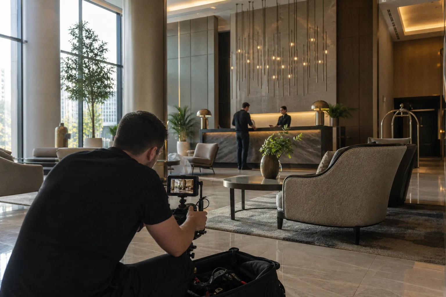
A hotel video can fail before the viewer reaches the booking engine. The cause is often visible in the first five seconds: clipped window highlights, green LED spill, orange tungsten pools, cyan shadows, and a LUT applied over footage that was never corrected.
The camera recorded exposure data. It did not record luxury.
Luxury hotel video color grading is a controlled conversion process. Raw LOG footage must be transformed into a display-ready Rec. 709 image, then shaped through contrast, midtone density, saturation, and color separation. The order matters. A cinematic LUT cannot repair incorrect white balance. It can make the error harder to detect.
The practical target is not “more cinematic.” It is a stable image that supports the property’s price position, preserves architectural geometry, and removes visual friction from the booking decision.
The CST Sandwich: the correct workflow for LOG footage
LOG footage is designed to preserve dynamic range. It is not designed to look finished on a web player. S-Log3, V-Log, C-Log, and similar profiles compress contrast and saturation into a format that retains information across bright windows, reflective surfaces, and dark rooms.
The mistake is grading the flat LOG image as if it were already in a normal display space. The scopes become misleading. Skin tones sit in the wrong relationship to contrast. LUTs react unpredictably. Saturation begins to break in highlights.
A cleaner hospitality video editing workflow uses a Color Space Transform, or CST, at both ends of the grade.
The workflow
1. Input CST
- Convert the camera profile from its native color space and gamma.
- Example: Sony S-Gamut3.Cine with S-Log3, or Panasonic V-Gamut with V-Log.
- Transform the signal into a wide working space such as DaVinci Wide Gamut with DaVinci Intermediate.
2. Technical correction
- Adjust exposure, white balance, tint, and contrast before the creative grade.
- Match neighboring shots at this stage.
- Use waveform, parade, vectorscope, and false color where available.
3. Creative grade
- Set the tonal hierarchy.
- Control midtones.
- Separate warm practical lights from cool exterior light.
- Protect neutral surfaces, white bedding, marble, and skin.
4. Optional LUT
- Apply a low-intensity creative LUT only after the image is technically stable.
- Treat the LUT as a starting curve, not a finished grade.
- Reduce its mix or gain if it crushes shadow detail or pushes saturation beyond the brand palette.
5. Output CST
- Convert the working space to Rec. 709 for SDR delivery.
- Use Gamma 2.4 for controlled Rec. 709 monitoring.
- For web and computer display exports, Gamma 2.2 is also a common target. The delivery environment must be defined before the final pass.
This is the CST sandwich. The first transform normalizes the camera signal into a workable space. The grading operations happen between the transforms. The final transform creates the display image.
A LUT is a look preset. It is not exposure correction, white-balance correction, or shot matching.
In DaVinci Resolve, this structure can be built with nodes. The exact node count is less important than the signal path. The image must be transformed before creative decisions are made, and the output must be transformed deliberately for the delivery format.
Why the wide working space matters
Hotels contain high-contrast scenes by default. A room can include a bright window, a dark wardrobe, reflective chrome, white sheets, a warm lamp, and a television screen in a single frame. A narrow working space can clip or compress color information during adjustments.
DaVinci Wide Gamut gives the grade more room for exposure and saturation operations. It does not create dynamic range that the camera failed to capture. It preserves more usable information during the process.
That distinction matters. A wide working space helps manage the source. It does not rescue a window that was recorded as a featureless white rectangle.
Exposure correction before color styling
Start with luminance. Do not begin by selecting a luxury LUT.
A typical correction pass should answer four technical questions:
- Are the windows holding usable detail?
- Are the shadow areas open enough to show furniture and circulation?
- Are white walls and linens neutral?
- Are practical lights warm without becoming orange clipping points?
Use the waveform to assess the entire frame. Use the parade to identify channel imbalance. Use the vectorscope to watch for excessive skin-tone or foliage shifts.
The goal is not to force every shot into identical numerical levels. A dark restaurant should not grade like a sunlit terrace. The goal is continuity. The viewer should move from lobby to room to balcony without seeing the color pipeline change.
Mixed lighting is the main failure point in interior hotel video
Hospitality interiors combine light sources with incompatible color temperatures. Warm tungsten practicals commonly sit around 3200K. Daylight entering through windows is often close to 5600K. LEDs may sit anywhere between those values and may carry a green or magenta bias that the camera metadata does not solve.
This creates a familiar failure pattern:
- The window looks neutral, but the room becomes orange.
- The lamp looks correct, but the exterior turns blue.
- The room is balanced, but white bedding shifts green.
- A LUT increases the contrast between all of these sources.
There is no universal white-balance setting for mixed lighting. The reference depends on the property, the intended visual hierarchy, and the light source that should appear neutral.
Choose the reference light
Before grading, decide what the viewer should read as neutral.
For a room presentation, the interior architecture usually takes priority. Walls, sheets, countertops, and cabinetry need stable color. Exterior daylight can remain slightly cool through the windows.
For a resort terrace, the daylight may be the reference. Interior practicals can remain warmer as a secondary source.
For a restaurant or lounge, warm practicals may be part of the property’s identity. The correction should remove contamination, not sterilize the scene.
The error is trying to neutralize every light source independently. That creates a technically clean frame with no spatial logic. The viewer loses the relationship between interior and exterior.
Use masks instead of global white balance
A global temperature adjustment is often too blunt for an interior. If the room is warm and the window is blue, moving the temperature slider affects both areas.
Use secondary corrections:
- Isolate the window area with a tracked power window.
- Reduce excessive blue or cyan in the exterior.
- Control orange spill on nearby walls.
- Neutralize large white surfaces with a narrow hue and saturation adjustment.
- Track moving camera shots so the correction follows the architectural planes.
Do not overcorrect the window into the same temperature as the room. The aim is separation without distraction.
Fix the source on set when possible
Post-production has limits. Lighting decisions made during capture determine how much friction remains in the grade.
Useful capture controls include:
- Turn off mixed-color practicals that produce uncontrolled green or magenta spill.
- Replace low-quality bulbs with fixtures that have consistent color rendering.
- Flag windows or reduce their intensity when the exterior is not part of the shot.
- Lock white balance for the full setup.
- Avoid auto-white balance, which can shift color temperature during a camera move.
- Record a neutral reference where the scene contains a gray card or known white surface.
Auto-white balance is particularly damaging in hotel walkthroughs. A slow pan across a room can trigger a color shift mid-clip. The edit then contains a moving correction problem rather than a single correction problem.
Mixed lighting is not a grading style. It is a measurement problem created by multiple references in one frame.
Interior shot matching
Shot matching should happen before the creative look is pushed across the sequence. Select a hero frame for each space. Match the surrounding shots to that frame.
A practical matching order is:
1. Exposure and black level.
2. White balance and tint.
3. Contrast curve.
4. Saturation.
5. Local color corrections.
6. Creative look.
Match the room first. Then match adjacent angles. Do not match every clip to the brightest shot. This lifts the sequence and removes depth from the property.
For tracking-heavy footage captured on a gimbal, check the grade at the beginning, middle, and end of the move. Reflections can change as the camera travels. A neutral wall may reveal a green cast only when the lens passes a window or LED fixture.
Defining luxury through contrast and midtone control
Luxury is not a fixed color preset. It is a tonal structure.
High-end property videos typically benefit from deeper contrast and controlled midtones. The image should retain detail in dark wood, stone, curtains, and furniture while giving bright surfaces enough separation to look intentional.
Budget listings often use higher brightness, stronger vibrance, and a more open tonal range. That approach can improve approachability for a mass-market property. It is not automatically appropriate for a five-star resort or design-led hotel.
The grade must support the commercial position.
Contrast without crushed detail
A basic S-curve is not a luxury grade. It is only a contrast tool.
The usual failure is aggressive black-point reduction. Dark furniture loses texture. Hallways become solid blocks. The room looks smaller because the visual information that defines depth has been removed.
Monitor these areas specifically:
- Dark wood grain.
- Upholstery texture.
- Black metal fixtures.
- Shadowed corners.
- Curtain folds.
- Restaurant interiors.
- Night exteriors.
The waveform should show separation inside the lower range. If all shadow information sits on the floor, the grade is not sophisticated. It is clipped.
Use the midtones to create density. Midtone control shapes how the room reads without destroying the highlights or shadows. A small adjustment to local contrast can make stone, timber, and fabric more legible than a global saturation increase.
Protect highlight structure
Hotel interiors contain large white and reflective surfaces. Bedding, marble, porcelain, glass, chrome, and polished stone can clip quickly after a contrast or LUT operation.
Use highlight roll-off rather than simply lowering exposure. A controlled shoulder keeps the image bright while preserving surface information.
Check:
- Window frames against daylight.
- White sheets near lamps.
- Bathroom ceramics.
- Glass shower partitions.
- Specular reflections on taps.
- Sunlit terraces.
- Pale exterior walls.
Pure white is not automatically a problem. Featureless white is. The visual question is whether the viewer can still identify material and form.
Saturation is not a proxy for value
High saturation often produces the opposite of a premium result. It makes carpet colors louder, foliage less credible, and warm lights appear synthetic.
A more controlled luxury grade usually relies on:
- Richer midtones rather than global saturation.
- Selective color separation between materials.
- Restrained highlights.
- Natural skin tones.
- Controlled greens.
- Stable whites.
- A limited palette that supports the property’s branding.
The vectorscope should be used as a guardrail. It does not define taste, but it exposes outliers. A single orange lamp or cyan pool can dominate a frame when the rest of the palette is neutral.
Architectural accuracy comes first
Color grading cannot compensate for poor geometry. A vertical wall that bends from a wide lens remains a problem after color correction. A room that is too dark remains difficult to evaluate. A green cast on a white wall can make the entire property look poorly maintained.
This is why architectural photography principles still apply to moving footage:
- Keep verticals stable.
- Avoid excessive wide-angle distortion.
- Preserve the relationship between foreground and background.
- Do not use contrast to hide weak composition.
- Do not use saturation to imply material quality.
The image has to pass a structural audit before it receives a luxury treatment.
Applying LUTs without destroying the property
The search for the best LUT for hotel videos is usually misframed. There is no single correct LUT for every hotel, camera, delivery platform, and lighting design.
LUTs are distributed commonly as .cube files. They can be loaded into DaVinci Resolve, Premiere Pro, Final Cut Pro, CapCut, and VN. Compatibility is not the problem. Signal order is the problem.
A creative LUT expects a particular input. If it was designed for normalized Rec. 709 footage and is applied directly to S-Log3, the result may show crushed blacks, clipped highlights, excessive saturation, or broken skin tones.
Separate technical LUTs from creative LUTs
A technical LUT converts one camera profile into a display space. A creative LUT changes the visual style. They are not interchangeable.
A safe sequence is:
- Convert the camera signal with CST or the correct technical transform.
- Balance exposure and white balance.
- Apply the creative LUT.
- Reduce intensity.
- Correct the LUT’s side effects.
- Check the result against the brand palette and adjacent shots.
Some LUTs are designed for specific camera profiles. Others assume Rec. 709 input. Read the technical notes. If the LUT’s input transform is unknown, treat it as an experiment and inspect the output with scopes.
Low-intensity LUT use
A luxury grade rarely benefits from a creative LUT at full strength. Full-strength application often produces:
- Crushed shadows.
- Excessive orange in wood and practical lights.
- Cyan skies and water.
- Over-saturated foliage.
- Skin tones that drift toward red.
- Reduced detail in pale fabrics.
- Hard transitions around window light.
Use the LUT as a contrast and palette reference. Reduce the mix until the source image remains credible. Then rebuild the desired look manually with curves, hue-versus-hue, hue-versus-saturation, and selective contrast.
A LUT that looks impressive on one still frame may fail across a 60-second hotel tour. Motion reveals instability. Different rooms expose different assumptions. A tropical exterior, a white bathroom, and a dark bar will all stress the same preset in different ways.
Coastal and tropical resort footage
Luxury resort LUT packs often target turquoise water, white sand, tropical greenery, and warm sunlight. These targets are useful only if they remain subordinate to the property.
Common problems include:
- Water pushed into unnatural cyan.
- White sand turning pink or yellow.
- Greenery becoming radioactive.
- Warm sunlight losing highlight detail.
- Skin tones inheriting the color of the environment.
Use separate corrections for water, foliage, and skin. Do not push the entire image toward teal and orange. That palette has become a compression artifact of commercial video, not evidence of premium production.
A better approach is to define the palette by material:
| Element | Desired control | Common failure | Correction method |
|---|---|---|---|
| Pool or ocean | Clean cyan-blue separation | Electric cyan with no depth | Reduce cyan saturation and protect luminance |
| White sand | Neutral warm-white | Yellow or magenta cast | Use hue-vs-hue and highlight balance |
| Tropical foliage | Dense green with texture | Oversaturated neon green | Lower green saturation and control yellow-green |
| Wood and practical lights | Warm but separated | Orange contamination across walls | Isolate warm sources with masks |
| Skin tones | Stable hue and natural luminance | Red or orange shift from LUT | Track skin and reduce selective saturation |
| White linens | Neutral reference | Blue, green, or clipped white | Correct tint and recover highlight roll-off |
The footage should still look credible when viewed without the grade. That is the basic test.
Color grading for interior video: a room-by-room method
Different hotel spaces need different tonal priorities. Applying one global look across the entire property produces continuity at the cost of function.
Guest rooms
The room grade must preserve scale and cleanliness. Keep whites neutral. Control window contrast. Avoid pushing the shadows so low that the bed, desk, and wardrobe merge into one mass.
If the room contains warm bedside lamps, let them remain warm. Correct the spill on white walls if it affects the architecture. The viewer needs to understand the room’s layout and finish quality within a few seconds.
Bathrooms
Bathrooms expose grading errors quickly. White tile, chrome, mirrors, and glass are unforgiving. Green or magenta contamination becomes obvious.
Use restrained contrast. Protect specular highlights. Check whether the grout, ceramic, and stone are separating correctly. A bathroom that turns blue in the shadows can look cold and poorly lit even when the original footage was usable.
Restaurants and bars
These spaces can carry deeper shadows. The mistake is treating darkness as luxury. A dark bar still needs readable tables, seating, materials, and circulation.
Warm light can remain a central design element. Keep it distinct from orange clipping. Use local contrast to reveal texture in wood and upholstery. Check reflections on glassware and polished surfaces.
Lobbies and corridors
Lobbies often mix daylight, ceiling LEDs, decorative fixtures, and reflective floors. Wide spaces amplify color inconsistency because the frame contains multiple surfaces with different reflectance.
Match the walls and floor first. Then control practical fixtures. Avoid lifting the entire corridor just to reveal one dark corner. Use local exposure corrections and tracked masks.
Exteriors and drone hotel tours
Exterior footage needs a separate exposure and saturation strategy. The sky, building façade, landscape, and water can occupy very different parts of the signal range.
Do not use the interior LUT without checking its response to daylight. Drone cameras may produce compressed LOG files with limited latitude compared with larger cinema sensors. The grade must preserve the façade’s true material color and keep the horizon stable.
For drone hotel tours, the camera move already creates visual information. Extra contrast or saturation can make the sequence appear processed rather than precise. Keep the building readable. Avoid turning vegetation into a color block.
Monitoring the grade accurately
Color perception changes with the monitoring environment. A grading suite should use controlled ambient lighting around 6500K. Fixtures with a CRI of at least 90 reduce color bias and eye fatigue.
This is not studio decoration. The surrounding light affects how the monitor image is perceived. A warm room can make a neutral image appear cool. A green-biased fixture can make a clean grade appear magenta.
Use a proper monitor position and stable brightness. Avoid grading beside a window that changes from morning daylight to evening shadow. The room is part of the color pipeline.
Scopes are not optional
The eye detects relationships. Scopes expose measurable errors.
Use:
- Waveform for luminance distribution and highlight clipping.
- RGB parade for channel imbalance and neutral surfaces.
- Vectorscope for saturation and skin-tone drift.
- Histogram for a quick view of tonal concentration.
- False color during capture and exposure review when supported.
Check the image at full size and reduced size. A subtle green cast on a wall may be easy to miss at 100 percent but obvious in a thumbnail. Booking pages often display video in a small viewport. The grade must survive that compression.
Web delivery changes the target
Most hotel marketing video is consumed on phones, laptops, social feeds, booking pages, and digital signage. The file may be compressed more than once. Shadow detail can disappear. Saturation can increase perceptually on bright mobile screens.
Export for the actual platform. Rec. 709 remains the standard SDR color space for broad compatibility. Gamma 2.4 is appropriate for controlled Rec. 709 monitoring. Gamma 2.2 is common for computer and web-oriented viewing.
The point is not to select one number mechanically. The point is to test the exported file in the environment where the booking decision occurs.
A grade that works in a dark post-production room can fail on a bright phone. A grade that looks balanced on a calibrated display can lose its shadow separation after platform compression.
Color grading as conversion control
Color is part of booking psychology because it controls perceived quality, clarity, and risk. This does not mean a particular LUT produces a known percentage increase in direct bookings. There is no universal verified conversion figure for color grading alone.
The commercial effect is indirect but measurable through the full content system:
- Video completion rate.
- Landing-page bounce rate.
- Click-through rate from property pages.
- Engagement with room-specific sections.
- Booking-engine progression.
- Direct versus third-party traffic.
- Split-test performance between graded versions.
- Heatmap behavior around video and gallery modules.
A grade can reduce friction when it makes the property easier to interpret. If viewers understand room size, material quality, daylight, and circulation, the visual asset is performing its basic job.
A grade can also create friction. If the room looks darker than it is, the property appears smaller. If whites are blue, cleanliness becomes ambiguous. If the pool is unnaturally cyan, the video looks generic. If every space has the same contrast curve, the sequence loses hierarchy.
Test the finished asset, not only the timeline. Compare the video inside the actual booking page. Review the first frame, the first five seconds, mobile playback, muted playback, and the transition from video to booking call-to-action.
The conversion problem is rarely “not cinematic enough.” It is usually inaccurate, inconsistent, or difficult to read.
A strict technical audit before delivery
Run the final sequence through a fixed review. Do not rely on memory or the appearance of the last corrected clip.
1. Confirm the input transform.
Verify the camera profile, gamma, gamut, and exposure interpretation. A wrong input CST contaminates every downstream decision.
2. Confirm the output transform.
Make sure the final image is converted to the intended display space. Rec. 709 delivery should not depend on an unverified viewing LUT.
3. Review white balance across each space.
Compare walls, bedding, tile, stone, and cabinetry. Look for color-temperature shifts between cuts and during camera moves.
4. Inspect mixed-light transitions.
Check windows, practical fixtures, LED spill, and reflected color. Use tracked masks where global correction creates new errors.
5. Check shadow retention.
Confirm that dark furniture, corridors, bars, and room corners retain texture. A luxury grade needs controlled blacks, not empty blacks.
6. Check highlight roll-off.
Review windows, white linens, marble, chrome, glass, and sky. Detail should remain visible where the source supports it.
7. Review selective saturation.
Inspect foliage, pool water, warm lamps, painted walls, and branding colors. Remove outliers created by the LUT.
8. Check skin tones.
Even a property-led video may include guests, staff, or hands interacting with the room. Keep skin stable while grading the environment.
9. Review the sequence at thumbnail size.
This exposes dominant color casts and weak tonal hierarchy. It also approximates how the asset appears in a booking-page module.
10. Test the export on the target device.
Watch on a calibrated monitor, a laptop, and a mobile device. Check compressed shadows, blown highlights, and color shifts.
The best hotel video color grading LUT is the one that leaves room for correction. It supports the source rather than replacing it. The final image should show the hotel’s actual materials, actual proportions, and actual light hierarchy with less visual noise.
Luxury tones are built through controlled exposure, stable white balance, disciplined contrast, and selective color. The LUT is optional. The audit is not.